Calder Guitar Case Design - comments please on a cleaner look
I asked Michael Mailling to run a Photoshop job on photographs of the prototype to take out the lazy S line across the case. I wanted for more simplicity. For some time I've felt that the sculpted look of this line was elegant but detracted from the authenticity of the design. My aim to produce a design of absolute simplicity and authority. My opinion is that removing the S has moved us in that direction.
What do you think? Better? Worse? Don't give a damn...? Send us your comments.
HOW IT USED TO LOOK
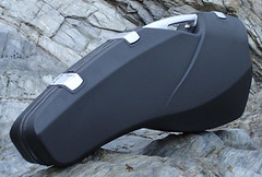

NEW LOOK
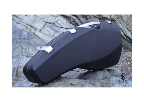
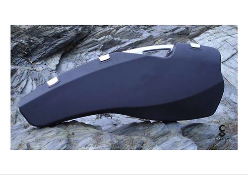
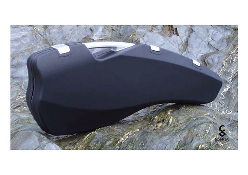
What do you think? Better? Worse? Don't give a damn...? Send us your comments.
HOW IT USED TO LOOK


NEW LOOK


0 Comments:
Post a Comment
Subscribe to Post Comments [Atom]
<< Home